Like some virulent strain of acne, the new-look classification symbols from the Office of Film and Literature Classification are currently popping up on movie posters and DVD packaging everywhere.

The classification system has gone from being a visible yet unobtrusive aid, to a lurid, incongruous, eye-sore. A big, goofy, candy-coloured, eye-sore. They make me twitch. They irritate like an allergic reaction. And they're patronizing: they’re so bright, they’re so BIG, like I’m some moronic mouth-breather you need to speak s-l-o-w-l-y and c-l-e-a-r-l-y to, preferably in short, easy to understand words. The old system weren’t broke! Why spend taxpayer dollars fixing it?
The OFLC state the reason for the change on their website:
Research conducted by the OFLC, as well as feedback it has received from consumers and industry, has consistently indicated that the old classification markings often suffered from being hard to find or hard to read because they were too small or not obvious enough against the background.
I have never - not once - had any problem with locating and understanding the old markings, and I find it difficult to believe that others would have either. Unless there was something wrong with their eyes or their brains. I suppose the symbols can move around on movie posters, but to only so many places.
Où est Charlie? it’s not. And on DVDs? Bottom-left front cover, bottom-right back cover and bottom of the spine. Every time. So where’s the problem?
Or are we perhaps talking billboards viewed from a moving car by the driver concentrating on the road in peak-hour traffic? That’s our baseline, people. That’s our minimum communication requirement. Dad’s driving home from work along the freeway, trying to choose “suitable entertainment products for his family and friends,” and all he’s got to work with are roadside billboards. He needs our aid! We need to “inform his choices!”
Informing your choices. There’s a disingenuous slogan if ever there was one. Quite how they inform my choices by banning films and restricting what I can see, I’m not too sure. I guess it's more catchy than "Informing your choices within a set of parameters determined by us" though, isn't it?
The old system was great! It did its job unobtrusively, and it was there to be found if you needed it. It wasn’t like neon signage out the front of a strip club. I can’t believe that so many people must have had so many problems - renting
Se7en for eight year old kids or something - that it warranted such a dramatic change. The OFLC’s pre-change research showed that the public had a very high familiarity with the existing symbols, so why not just stop there? Job well done, let’s call it a day. No, they had to use my money to go and tinker. And what did they decide was missing? Colour! The old system had no colours! Ye gods! No wonder there was such confusion.
The best rationalisation they can come up with for introducing colours is: “The use of colour will assist consumers in choosing suitable entertainment products for their family and friends.” This is what feels so patronizing. Letters apparently aren’t enough for adults, they need conceptually appropriate colours too. So, I'm guessing
Green is ‘Friendly’, good for kids;
Yellow is… also ‘Friendly’, although I find it unsettling; and
Light Blue is… still pretty ‘Friendly’ really. I’m not getting much sense of a scale here. Ah, here we go:
Red is ‘Warning! Danger!’; and
Black is clearly ‘DEATH!’ So I’m not too sure what the colours add? They’re not clear indicators by themselves, they still need the letters, so why not just have the letters? Do another survey OFLC and ask people to identify what ‘Light Blue’ signifies. And of course everything falls apart in newspapers where most ads are all black anyway. What?
Free Willy 12: Freedom Baby Yeah is rated ‘R’?!
I don’t mind classification info, I just don’t want it to be the primary point of attention. These new symbols are big and they’re bright. The ‘designers’ have certainly fulfilled the brief criteria to make the symbols more visible. In spades. My problem is that these now glowing beacons are then indiscriminately slapped onto a poster or packaging with no regard for its existing look and feel. A designer and/or artist has toiled to craft a poster that creates a mood and conveys the tone of a film. The image sucks you in and helps you imagine the world of the film - or it would, if you could just drag your eyes away from that enormous coloured box in the corner.
It’s an issue for me because I love my cover art (music CDs included), and I like to enjoy it as its creator intended. If it comes with stickers stuck on, the stickers come off. No price tags, no ‘I’m cheap, buy me now!’ and certainly no ‘The latest album from Whoever featuring the hit single Whatever’. I hate those. If the band’s name isn’t on the cover, that’s how they want it to be, but thanks for helping record company. A cover is a small canvas, but it’s still a significant one, and one that I don't think should look like some cyclist's jersey or a piece of packaging
designed by Microsoft.
Now with some images, like this postcard for
Charlie and the Chocolate Factory, it doesn’t really matter.
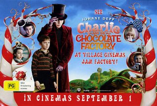
There’s so much colour in the image already that the rating is barely noticeable. So really, sometimes the new system’s made no difference at all; the rating's just as “hard to find” as ever. Where I think it does matter though is with covers like this one for
The Passion of the Christ.

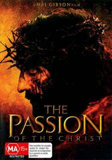
Could you spot the difference? The artist has carefully crafted an intense and powerful image, filled with mood, emotion and drama, with a deliberate and restrained colour palette, and then the OFLC go and whack a bright red sticker on it like it’s a Red Spot Special at Safeway. Suddenly there’s this glaring distraction competing for your attention and sending the visual to hell.
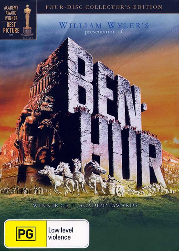
Look at
Ben Hur for another example. What do you notice first? The wonderful, iconic image or that yellow blob that competes in its unsubtly with Charlton Heston’s acting?

I wonder if any directors will aim for a particular rating so that the classification sticker won’t compromise the film’s imagery? If I was a director I hope I wouldn’t, but you never know. “I know I’m making
Texas Chainsaw Massacre 2, but that yellow sticker would match the poster’s palette best, so do you mind if I don’t show any chainsaws? Or killing? Or actual violence?” Where the colours are concerned, I think the Dr Who packaging below is close to the best you can hope for. Different shade of yellow but, hey, I’ll take what I can get.

Last year a poster for the classic 1920 film
Metropolis was sold for $A941,000. It’s a sale that I think shows how significant an artform film art can be. Lucky the poster pre-dates the OFLC. I’m not sure how the price would’ve been affected if there’d been a big green, G-rated blob on it.

Sure, not all film imagery and packaging is as significant or as deserving of respect, but on the whole I think it’s something that deserves to be treated with more respect than the OFLC is affording it now. I like the American system (circled below in green). Discreet, there if you need it, and allowing the cover art to speak with its own voice, unmolested by innumerable bits of superfluous junk. (I know this is a Platinum Edition, and so therefore cleaner than most, but this is my ideal).

I guess I can’t turn back the Australian clock, but at least I can buy Region 1 DVDs if I need to. Thank you Office of Film and Literature Classification for helping to inform my choices.












 Posts
Posts

