Showing posts with label rants. Show all posts

Wednesday, May 04, 2011

Happy Star Wars™ Day™.

I wasn't going to do a post for Star Wars™ Day™ this year. It's getting pretty tough coming up with new reasons to be excited (and new illnesses), and I didn't want my annual posts to become little more than a whinge about how much better things were back when I were a boy. Wa, wa, wa.

But then a friend sent me an article, I was a Star Wars fan – I'm still recovering, that so perfectly captured my own experience (someone else played Tapper?!), that I thought, "What the hell, one more whinge for old times' sake."
It's been a rough dozen years for us Star Wars fans. The release of The Phantom Menace split the community in half, the gushers (people who loved it) and the bashers (people who didn't). If you can't tell from my equating fandom with alcoholism, I am a basher. Each of the next two movies, Attack of the Clones and Revenge of the Sith, was worse than the last, and it became increasingly hard to identify as a fan. After all, the whole franchise was based on six feature films, and I hated half of them (and only sort of liked Return of the Jedi).
Do click through. It's a great piece.

I've got to say, the deeper I get buried in disappointment, the more I warm to the idea of rebooting the franchise. My. I never thought I'd say that. I'm generally opposed to rebooting, just on principle. The current craze for it—Battlestar Galactica, V, The Hulk, Spiderman, Star Trek, Conan, etc, etc—reeks of profiteering; less, if at all, about telling better stories than simply exploiting nostalgia to maximise ticket sales.

But with Star Wars I'm prepared to make an exception. Because let's just admit it: the Star Wars saga is broken. Broken beyond repair. The warning signs were there in 1997 with the Special Editions, but it wasn't until the Prequels that the rot really set in. And as the years rolled by, the infection has spread so far that the only thing to do is burn the bugger to the ground and start again.

It's a drastic solution, for sure, but as I see it, rebooting would offer a chance to fix three of the Prequels' biggest flaws.

1. Far too special effects
George Lucas once said:
"Special effects are just a tool: a means of telling a story. People have a tendency to confuse them as an ends unto themselves."
And George should know, because it's a tendency he's fallen into himself. He continues:
"A special effect without a story is a pretty boring thing."
Well, quite, but did you really need to make three multi-million dollar films to prove it? Point made! Give it a rest. What story there was in the Prequels was there only to support a special effects showcase. If Lucas had put the effort into crafting his narrative that he put into conjuring his effects, the Prequels might even have been good.

2. Joining the dots
One big problem with the Prequels is that faced by any prequel: we already know how it's going to end. Maybe not the details, but certainly the framework, and Lucas didn't try to subvert or challenge this at all. Like, we all knew Sidious was Palpatine, right? The hints were as subtle as a Force push to the face. Well, imagine it had turned out he wasn't! Imagine if Lucas—knowing what we thought we knew—had appeared to confirm it, only to pull the walking carpet out from under our feet when the great reveal finally occurred! But no. He joined the dots from A to V and woke us all up when we got there.

Rebooting would let us re-establish the characters we love, then enjoy their continuing adventures into the unknown. Han could live again! Sure, no one can replace Harrison, but everyone else is up for grabs, right? It's not like Mark Hamill, bless him, won any Oscars for his performance. Actually, thinking about it, maybe Harrison can be replaced? I'd love to see Sam Rockwell's Han Solo. Or Ed Norton, Christian Bale, Josh Brolin or even Brad Pitt! And what about Rupert Grint trying out for Luke? Seriously. And Emily Browning for Leia? Anyway.

3. Forward to the past
It's always bugged me how the universe of the Prequels is so obviously more technologically advanced than the Classic trilogy. And saying the galaxy withered and went backwards after the fall of the Old Republic doesn't explain how a slave boy's podracer can be more sophisticated than the Imperial military's frontline fighters. Anachronisms like that yank me out of the universe and remind me I'm watching a film made 20 years after the first. But a rebooted universe would let us start from the start (crazy!), and advances in the world of filmmaking could walk hand-in-hand with the worlds of the film. Everything can match, continuity can be achieved, and balance can be restored!

'Course, none of this could ever happen before—God forbid—Uncle George shuffles off to a galaxy far, far away... but we can dream, can't we? Dream of a re-imagined Classic trilogy—essentially unchanged (the Ewok storyline needs tweaking)—but made with today's filmmaking technology, followed up by an adaptation of Timothy Zahn's Thrawn trilogy, and concluded with a third trilogy based around the Yuuzhan Vong series. Or even better, get Zahn and the equally great Michael A Stackpole to craft something new altogether! And Peter Jackson can direct the lot! Or Christopher Nolan! I'm not picky. They can take it in turns if they want. Sure, it'd have to be done right—and there's oh-so-so much potential for it to go horribly wrong—but hey, I'm an optimist, so I believe.

Right, I'm off to watch Empire again. Happy Star Wars™ Day™. May the fourth be with you.

UPDATE
Now this could be interesting. Joe Johnston, Hollywood director and the man credited with designing Boba Fett's armour, wants to spin off a Boba Fett film. Not quite what I was thinking off, but it could be great—if it brushed with small strokes, limiting itself to a standalone story and avoiding any reference to Boba's growing back story. Young Boba in the Clone Wars animated series wasn't as bad as in the Prequels, but he wasn't much good either as he had to carry all of Lucas' baggage from the Prequels. I guess we'll see.

UPDATE 2
You're really not doing yourself any favours, you know, George? Sigh. The Blu-rays are out, and Lucas' urge to tinker is as irresistible as ever. The Ewoks now blink—at last—and arguably the worst moment in the Prequel trilogy now finds a reflection in the Classic. Nooooooooooo! Does anyone—even Rick "That's fantastic, George" McCallum—think these changes are good? Do any of them enhance the story at all? When will it end? Embarrassing.

UPDATE 3
George Lucas Strikes Back. With a little help from some old friends. Very good.


Tuesday, August 24, 2010

An Old Hope.

Nearly caved in and bought Star Wars on DVD today. Came to my senses as I stood there holding the discs in my hand, about to head for the checkout. I've waited a long time; I can wait a little longer. I've bought the Trilogy twice over already, and won't be doing it again until I can get the version I really want. I might be waiting a looooong time, but that's ok. I know how to wait.

I first bought the Star Wars trilogy in 1995, when remastered versions of the original films were released on the format of the day, VHS. Two years later, the Special Editions were released with suitable fanfare, and I bought the three films again.

Though initially a fan of the SEs, as I rewatched them over the years I grew to dislike them. A lot. Almost without exception, the changes were pointless...


...ridiculous...


...or brainless.


That is the same frame up there, if you can believe it. Can you find where Wally the stormtrooper is? He's behind the dinosaur. Can you see the dinosaur? Yep, just to the lef... that's it! I still haven't found Wizard Whitebeard or the scroll, but they've got to be there somewhere.

Worse, a number of actual issues that could have benefited from revision were overlooked – the monochrome, wireframe graphic displays in the TIE fighters and X-wings, for example.


How is it that the podracer of a slave boy on a planet furthest from the bright centre of the universe has a more sophisticated display...


...than the frontline fighters of the Imperial military? Unbelievable.

The worst change of all though was Greedo shooting first.


This bewildering revision completely undermined the integrity of arguably the saga's greatest character, Han Solo. How Lucas could believe Han getting the drop on an unsuspecting Greedo was somehow contrary to Solo's character… I just don't get. And how we're meant to believe Greedo could miss from that range after minutes sitting there pointing a blaster right at his target, I get even less.

No, the SEs are no good. The remastering had improved the sound and made the colours rich and even, but the changes to the story and the characters had compromised the overall package. The earlier remastered editions didn't have that problem, but the quality of VHS still left a lot to be desired. Ideally, what I wanted, if it wasn't too much to ask, were the original cinematic versions, remastered, and on a high-definition format. Like DVD! How about it, George?

Sadly, no. When the DVDs were announced in 2004, the SEs were the only option, as Lucas said they fulfilled his original vision. But like the future, always in motion is the original vision, apparently, as the Special Editions that made their way onto DVD were different to those already released on VHS. To be fair though, this time the changes weren't just indulgent tinkering, but an attempt to make connections between the classic trilogy and the new prequel trilogy which was busy crashing down around us. But once again, what started out sounding like a good idea resulted in confusion and disaster.

Anakin Skywalker's ghost, for example, which appears at the end of Return of the Jedi, was changed from Sebastian Shaw's time-of-death visage to the youthful, Prequel-era Hayden Christensen.


What?! What's the significance of that? How come Yoda and Obi-Wan's ghosts didn't get to visit the Force fountain of eternal youth? Is Hayden somehow meant to represent a redeemed Darth Vader, perhaps? This is the same Hayden who slaughtered all those adorable little Jedi kiddies, right? Sigh.

The Specialer Editions were also another opportunity for George Lucas to ruin Boba Fett. His demolition began in Attack of the Clones with the introduction of Boba's father, Jango Fett; a character who shared more with his son than just a family name. In a failure of imagination not seen since the second Death Star, Boba and Jango wear the same armour, fly the same ship, work the same trade, and even share the same reputation. I know Boba's supposed to be a clone of his father, but isn't that taking things a little too far?

Not far enough for Lucas, apparently, who, after taking away most of what made Boba unique, took away the one thing he had left: his voice. Gravelly and menacing, Boba's voice suited the character perfectly. But with the revelation that Boba was a clone of his father, Lucas decided to re-record Boba's handful of lines from The Empire Strikes Back using the voice of Temuera Morrison, the actor who plays Jango. Once a mysterious figure of power and menace, Boba Fett is now little more than a photocopy of his father. I'm sure Lucas intended it to be some sort of tribute to a fan favourite, but in making Boba the template for the entire clone army he's completely missed the point of what made the character great.

Even if you accept the whole clone thing, this change makes no sense to me. If anything, the different voices just add to the mystery of the character. Yeah, why doesn't he have the same voice as the other clones? Maybe it's as simple as his helmet having a voice-modulator to conceal his true voice? Like Darth Vader. Sebastian Shaw's unmasked Darth Vader sounded nothing like James Earl Jones. Or maybe it's a long and complicated story that Kevin J Anderson will eventually ruin by writing a book about it.

Anyway.

Then, after most people had gone out and bought the only DVD option it looked like we'd be getting, it was announced in 2006 that the Classic Trilogy would be released again, this time in a six-disc collection containing the three SEs and their original cinematic versions as well! Hurrah!

But there was a catch.

Hurooh. The cinematic versions were a straight rip from the laserdiscs which had never been remastered. Finally the best of both worlds – original and remastered – existed in high-definition, but on different discs. That those discs came bundled in the same box only heightened the frustration. So close, yet so far, far away. Sigh.

I still cling to my old hope that Lucas will eventually get bored or whatever, and remaster the original versions just for the hell of it, but I'm not holding my breath. Lucky no one's pumping dioxis into the room. Dioxis. Sigh. "Hey idiots. Have you ever heard of carbon monoxide?"

UPDATE
Well, as was prophesied long ago, the Blu-ray version of the Star Wars saga has just been announced. To, by now, no one's surprise, the Special Editions are the only versions to make the cut. The surprise came from Lucas' explanation for not restoring the original versions, which was that it would "cost too much"! Seriously, George? Bit skint just now, are you? Has the merchandising machine broken down and you've had to stop printing money for five minutes? And remind me how much it was you spent making the Prequels? Actually, don't. Forget it.

Anyway, I don't mean to sound bitter. Really I'm not too disappointed because I'd already decided to skip Blu-ray as a format, anyway. Physical media is soooo last century. Thanks to services such as the iTunes Media Store, I expect Blu-ray will become obsolete faster than DVD did. Why spend all that money on an expensive Blu-ray player and overpriced discs when there's an option like the latest Apple TV? No need to trek down to your local retailer/renter for movies or TV shows; you can get what you want without getting off the couch. Just a few clicks of the remote, and you're away. And as my friend Glamma said in response to the news: "Nope, I genuinely don't care. It's hard to get too excited over seeing movies made in the early 80s transferred to Blu-ray." Quite so. As a Collector of Things, I don't find a digital collection as satisfying as a physical one, but the sheer convenience is undeniable. Blu-ray schmu-ray.

No, you can't always get what you want, but that's ok. There's something right about watching Star Wars on crappy old lo-fi VHS. Seems appropriate. Do you think Luke's got a Blu-ray holo-player there in his little man-shed? I don't think so; he'd have a VCR for sure. One that needed a new power converter. And its heads cleaned.

UPDATE 2
This post is already too long, but no whining about the SEs would be complete without mentioning Jabba the Hutt. That scene blows.

UPDATE 3
I know I said this post is already too long, but the hits they keep on comin'. Hot on the heels of Lucasfilm's Blu-ray announcement comes the news that the Star Wars saga is to be rereleased in 3D. In 3D. Sigh. So, remastering the originals is "too expensive", but converting them into freakin' 3D – a process that can take up to a year – isn't? You know, George, you're really not doing much to counter the widely-held belief that you're cynically exploiting the devotion of your fans for commercial gain. 

What a waste of time. I'm not a fan of 3D films at all. It's the Emperor's New Film Studio. 3D is a gimmick that adds nothing to a film, but $10 to the price of admission. I don't mind films that've been conceived as and shot in 3D, like Avatar, but two-dimensional films converted to 3D in post-production are a con; no more than a marketing ploy to generate hype and drive ticket sales. 3D is just one more thing to distract filmmakers from the most important part of a film: the story! Forget 3D. A 2D film with a three-dimensional story will beat the reverse every time.

UPDATE 4
Simon Pegg on Twitter: "Watching TPM [The Phantom Menace] in 3D would be like the car actually crashing into your face as opposed to just unfolding before your eyes." 

Gold.

UPDATE 5
One more. Just read this interview with Jeremy Bulloch by Vanity Fair. I like Bulloch. Not just because he was the original and best Boba Fett, but because he seems genuinely enthused about his role in Star Wars. He's not too cool for it, or resentful of the attention it's brought him; he seems to have greatly enjoyed his time working on the films and is grateful for the experience.

Of particular note, I was pleased to see him say he didn't think they should have changed Boba's original and "far more menacing" voice. And that's not him being precious or protective, as Boba's voice wasn't his anyway; his on-set dialogue was overdubbed by American actor, Jason Wingreen. And the bit here where Bulloch does his impression of Wingreen's voice reminded me of when I met him at a signing years ago. As I handed him my Boba headshot I asked if he could write "Survive" on it as well as his name, and he laughed as he intoned, "What if he doesn't survive…" in his best gravelly Boba impression.

Hearing Bulloch favours Boba's original voice also reminds me of when I met Timothy Zahn, the author who coined the name Coruscant for the Imperial capital. When reading the books I'd always pronounced the name as corus•cant, with a hard c. But in the films the actors all pronounced it corus•sant, with a soft c. So, as the creator, I asked Zahn how he pronounced it. "With the soft c," he told me, but he wasn't too upset as he was grateful Lucas had decided to use his name at all and not come up with one of his own. That's fair enough, but I felt validated none the less. :)

UPDATE 6
Another interesting Boba Fact: the Star Wars Holiday Special, broadcast in November 1978, has long been considered the first appearance of Boba Fett. But thanks to the Lucasfilm archives, it's been revealed his first appearance was actually two months earlier at a public parade in San Anselmo, California. Let the record show! Phew. The less we need to mention that Holiday Special, the better.

Sunday, April 18, 2010

Highly Recommended.

Given the obvious retort, the longevity of this image in bus shelters across Melbourne continues to surprise me.


Well, if it was that uncrowded, I'd prefer public transport, too.

You'd think in the current climate of seething commuter frustration over chronic overcrowding, Metlink would take an ad like this down out of embarrassment. But no, they leave it up and, like an armpit in peak hour, they rub our faces in it. They even put up a billboard to make sure we got the message.


I mean, how can anyone take this ad seriously? How could those who approved the image have seen it and not thought, "Wow, we're kind of leaving ourselves wide open with this one, hey? Um, what else have you got?"

Something a little more reflective of reality may not excite the Metlink marketing department, but at least it gives potential commuters a better idea of what to expect, wouldn't you say?


And their next attempt on the theme wasn't much better. "How can we make public transport more appealing?"


"Well, we could tell people it's like travelling beneath a giant shark!" What?

And then along came a whimsical little campaign where some folksy fellow (who bore a striking resemblance to the delightful Frank Woodley), highly recommends I get on the bus.


Just weird.

First of all, who is this man and why should I listen to his opinion on buses? What does he know about them that I don't? More importantly, what does he know about me and my particular transport needs? Nothing! The arrogance of him to suggest I need to do anything.

Secondly, why is he highly recommending the bus but not other forms of public transport? Are buses now fully fitted out with Human Touch massage chairs perhaps? Because I'd go out of my way to catch a bus with Human Touch massage chairs on board. Is that what he means? Who knows. He doesn't expand. He just waves and tells me again to get on the bus.

But most importantly, what's with the wording? I highly recommend you get on the bus? Is it just me, or does that sound like a threat? Thinly veiled and menacing, delivered through gritted teeth, like you wouldn't want to find out what'll happen if you don't get on the bus. Don't make the man with the acoustic guitar mad. You wouldn't like him if he was mad. "Nice little car you've got here. Be a shame if something… happened to it, you know? If it had a little… accident, you know? I highly recommend you get on the bus." Shudder.

And would it be unkind of me to ask if you're highly recommending the bus to people with myki cards? Yes, it would be unkind. I know your campaign pre-dates the "launch" of myki. That was a cheap shot. I apologise.

Then a few months later it was revealed the man didn't just look like Frank Woodley, it was Frank Woodley!


Well, ok; now I know who you are, but I'm still not sure why you're qualified to offer an opinion on the merits of travelling by bus. In fact, if your regular job is telling jokes, how do I know I'm now supposed to be taking you seriously and not waiting for a punchline? How do I know you've even ever travelled on a bus and aren't just being paid to smile and play a quaint little jingle for us?

Because I'll tell you what I do know: when I used to catch the bus, I found them to be highly unreliable. I spent more time than you'd believe standing at a stop, staring off to the horizon, waiting for a bus that never turned up. It happened so often that eventually a friend highly recommended I get a bike. Which I did, and my journey to and from work has been the better for it ever since.

I don't know. Public transport just doesn't seem like it should be so hard to advertise. We lurch from one lame campaign to another, and even when they get it right, they still manage to get it wrong. Not even bringing Harry Connick, Jr. on board worked. In fact that campaign was arguably the greatest train wreck of the lot. Shudder.

Here, I've got a recommendation of my own. You know what I love about public transport? I love getting to read my book. Or watch TV on my iPhone. I love getting to stare out the window and daydream – or close my eyes and doze – without the fear of crashing into anything. I love not having to buy petrol or pay for parking. I love not having to worry about what speed I'm doing or whether I can make that orange light before it turns red. I mean, there's your campaign right there, Metlink. Focussing on the benefits rather than trying to be too clever is highly recommend, and I think you'll find your customers will prefer it.

UPDATE
I've since learned that the shark pictured above is a whale shark; a breed often used by shark aficionados to counter the popular misconception that all sharks are ferocious man-eaters. Don't think you're safe in you're plankton though, because the whale shark murders them by the boatload. So, it's not the deadly killing-machine I'd been counting on to support my argument, but I still say using any shark to sell PT is an odd choice. In advertising instinctive responses are important, and my first response was SHAAAAAARK! I only learned it was a loveable whale shark by asking friends, and then of its preference for plankton over warm human flesh only by extended reading on the Internet. By contrast, 0.125 seconds after seeing the poster I'd decided that if that's what public transport is like, I'll see you tomorrow from behind the wheel of my car. Shark.

UPDATE 2
Incidentally, did you note the freelance editorial update to the Metlink billboard above? Some activist has clambered up there with a spray can and crossed out 'public transport' so the message reads, 'Nature prefers a nuclear free future. Habitit.' How odd. I mean, if you're going to vandalise a billboard advertising public transport, shouldn't it be to make some kind of comment on public transport? Has Metlink started using nuclear powered trains? No? Well why are you attacking their environmental message to promote your own? A little selfish, isn't it? It's great that you care about the environment, but so does Metlink. They're on your side, friend. Or were, until you climbed up and ruined their ad.

UPDATE 3
Got off at Flinders St Station today noticed this little poster.


Good point, Metro! You've convinced me. That wasn't so hard now, was it? Not sure why you're putting it up at a train station though? Preaching to the converted, aren't you? I mean, everyone reading your good sense is already going on, taking the train, right? Surely you'd be better off getting your message out somewhere like, oh, I don't know, somewhere there are people in cars reading road maps? Just a thought.

Friday, October 10, 2008

Coming Up: Olympics.

Just in time for the London 2012 Olympic Games comes a few random reflections on those held way back when in Beijing. Better late than never, I guess? They were topical when I started writing them, so I thought I may as well finish and post the buggers. For posterity. Or whatever.

Coming Up: Inaction Replays
If I die having never seen another super-slow motion montage, I will die a happy man. Even if it means never again seeing the parched runner and his miracle butterfly. In fact, especially if it means never seeing the parched runner and his miracle butterfly. That clip creeps me out. Once the novelty, like the butterfly, flitted away, all you were left with was the faintly erotic scene of a man languidly raising his water bottle to his mouth and gushing its contents all over his face. Um, can we move onto something else, please? Oh great, here's some swimmer's arm moving in super slow-mo. Not an actual swimmer; just an arm. Brilliant.

You know , I thought they might have tired of this toy by the end of the Athens Olympics, but no, here we are, four years later, still watching the same excruciating, poorly-framed shots that cram five minutes of highlights into nearly an hour. I switched to SBS, hoping for some relief, only to discover they were playing the exact same montage. Interestingly though, where Channel 7 felt high-intensity, British alt-rockers Muse to be the perfect aural accompaniment, SBS went with... yep, Andrea Bocelli. A more apt illustration of the difference between the two networks would, I think, be hard to find.

Coming Up: Breakfast
And speaking of soundtracks, to my abject horror Coles latched onto Sia Furler's beautiful song, Breathe Me, for their mawkish tribute to the "unsung heroes" of every Olympics since time began: the mums and their magnificent food preparation skills. Unless the mums bought their food from Safeway, sorry, Woolworths, in which case they're just losers. Like their loser kids who come eighth, or whatever. Losers. Anyway, Breathe Me was put to much better use in the final climactic scene of the brilliant Six Feet Under, a scene so moving and wonderful that every viewing leaves me a teary trembling mess. And then along stomps Coles, muscling into my subconscious and squeezing out my precious associations with early mornings, crunchy apples and Camberwell mums living vicariously. Realising my desperate situation, I got out my Six Feet DVDs and put myself through a rigorous reassociation regime, until once again those first few notes brought nothing to mind but Claire driving away and people keeling over.

Coming Up: Landmarks
Since TV networks began to brand their programming with digital watermarks, they've gradually mutated them from a quiet kid in the corner to an attention-seeking extrovert. Larger, more elaborate, often coloured and at times even animated, watermarks are now mostly so only in name. And then into the ring swaggers Channel 7 with their bold as a dog's bollocks offering for the Olympics. Not only larger than any I've ever seen before, it was also completely opaque. Nothing like Exclusive Rights to bring out the brazenness in a Television Network.

Also brazen was Channel 7's refusal to be constrained by anything as helpful as a timeslot for their televised events. Everything was always "Coming Up..." but you could never be sure when. And to make things even more difficult, the network seemed to have put a bored teenager with a remote control in charge of programming. Ten minutes of water polo, five minutes of rhythmic gymnastics, a little bit of track and field, two shots of men's basketball, aaaand back to the water polo. Liberally spiced with ads, of course. The water polo game clock said there were 10 minutes of boredom to go, so I went and made a cup of tea and checked my email, only to discover upon my return that there were still 10 minutes of boredom to go! Either time had just stood still, or they'd spliced in a chunk of some other event to keep things... I don't know, interesting? No idea what the event was, but as time ground on I eventually realised it must have been the one I'd been waiting for, as suddenly its time was no longer "Coming Up," it was just up.

Coming Up: 1980
The closing ceremony was a real letdown. Course, after the sprightly Joanna Griggs reported the Chinese as saying the spectacle would surpass that of the Opening Ceremony, it never really stood a chance. Doubly so, when the eventual production turned out to be only slightly more spectacular than a high school Rock Eisteddfod. More maniacally grinning, frantically waving people riding bikes? Nooo! Quite why the Chinese went blasting our expectations up into the stratosphere like that, I'll never know. True to form, Channel 7 refused to be locked in to a starting time, and so, after Joanna's 15th assurance that the Closing Ceremony was "coming up," I set the VCR running and went to bed. Thank the Maker and his oil baths that I did, because when I sat down to watch it the next day, there was still a half hour of ads interrupted by the occasional programme break to go. As I tore through the interminable lead-up like a Jamaican down the home straight, I once again gave thanks to my VCR and its blessed day of manufacture.

Coming Up: The Bill
While I marvel at our nation of just over 20 million people placing sixth on the Medal Tally against the whole entire world, when I read that each medal cost us around $17 million in federal grants, I had to wonder if it was worth it? I know you can't put a price on inspiring the next generation of Aussie kids to swim really, really, really, really fast, but still, $782 million is an extraordinary sum. I guess, at least, when we're told (repeatedly) that the athletes are doing it for us, it's actually true?

Coming Up: Smitty!
• And finally (to finish on a positive note amidst all this whining)... Go Smitty! (Surprisingly, the Wikipedia link to Smitty's Hockey Australia profile doesn't work, and I don't know how to fix it (Phil?), so if you want the lowdown on Smitty, go (Smitty) here! Yay!

Monday, January 15, 2007

Fly Byes.

A deadweight has been cut loose from around my neck and I’ve been set free; set free to fly.


I have been accruing wretched, bloody Fly Buys points since… glory, how long has it been? Well, since soon after the scheme’s inception in 1994, so 10 years, at least. Right from the start, a friend of mine who worked in Marketing at BP called Fly Buys, “the worst customer loyalty scheme in history.” As Fly Buys was linked to Shell, not BP, however, I assumed his was just a case of sour grapefruits, and kept on collecting those points anyway. I mean, I had to buy petrol, I had to buy groceries; why not get a little something extra for doing the things I had to do anyway?

The problem, of course, is that it takes more than the odd purchase of petrol and assorted food stuffs to collect enough points for even the smallest of shiny trinkets. It takes strategic purchasing and lifestyle alteration to get anywhere close, and with no credit card, no home loan, and no dupes to farm additional cards out to, I was left paddlin’ around in the shallows.

But I plugged away with my groceries, my petrol, and occasional BONUS! points from a triple-pack of chewing gum or whatever, only to discover several years into the scheme that Fly Buys points have a shelf life! Don’t cash them in within three years and, like your dreams for that ‘Kambrook Pancake Factory + Omlette Maker’, they disappear in a puff of smoke. You don’t just need to work hard, you need to work fast! I was trapped on a treadmill of insanity, frantically grabbing for new points while old ones flew out behind like a ticker-tape parade down Main Street.

I should have jumped there and then, but it was like being on hold for 20 minutes: If I’d known it was going to take this long, I wouldn’t have bothered, but now that I have, I can’t give up, because then it REALLY will have been for nothing. And if I’ve been at it this long, surely the end will come any second now… any second… five, four, three, two, one… and a half, one… damn it! Too late I realised my friend had been right all along, and every time I used my card I felt him and his beloved BP Bookmuncher floating just over my shoulder, shaking their heads in disappointment.

And then, out of the blue, Fly Buys sent me a second card that someone else could use, but that would be linked to my account. With duplicitous words and promises of untold riches I convinced Kate to join me, hoping that together we could knock this one over the fence. And we did actually manage to make some small headway, and so set ourselves the goal of gathering the 12,000 points required for a dozen bottles of wine, before getting out the scissors and calling it a day.

Fast-forward several lifetimes, and at last that great day arrived. The day we held in our trembling hands a Fly Buys statement with enough points for the Wyndham Estate Mixed Dozen! We simply could not believe this journey was about to end. And, of course, it wasn’t. The statement had arrived on the last day of the month, and 300 precious points were primed to be blasted into oblivion when the new month began. A loss that would take us just under the required number of points. “Quickly! Find the phone,” I bellowed. “Let’s cash these first-born in while there’s still time!” Which, of course, there wasn’t. It was now outside business hours, and the head-smashingly perky Fly Buys robot told me to call back tomorrow when the team would be delighted to assist me with my enquiry. “To the Internet!” I screamed. “There are no business hours on the Internet!” Which, of course, there are. And after logging in I discovered that not only had they shut down for the day, they’d also already stripped me of my 300 points although the current month had several hours to live! It seemed as though the excruciating journey would go on.

But then Bomber – who had recently brought his own drawn out Fly Buys saga to a 12 bottle conclusion – swept down like an angel of mercy and bestowed his wisdom upon me. While my 11,992 points was not enough for the Wyndham dozen, it was more than enough for the Cleanskin Dozen. “Cash ‘em in, and be done with it,” he ordered me, and I did. Twelve labels are not worth the grief.

And so, a new dawn. Yesterday, I filled up the car at whatever service station I happened to be driving past, handed over some cash, and walked the hell away. It was great. On my way home I also popped into whatever supermarket was convenient, which just so happened to be Coles. At the register, the checkout executive asked me if I had Fly Buys? “Certainly don’t,” I replied with a smile. “I’ve just set myself free from Fly Buys and ditched my card into the bin. It’s wonderful.” With an expression as bored as a plank of wood, she held my gaze for a second, before wordlessly turning back to her register to complete my transaction.

Oh well, I never expected everyone to share my excitement.

Friday, October 27, 2006

Set up.

What began as part of another story has taken on a life of its own. I can’t believe it’s happened again.

There are few things I love more than a good collection. Gathering, sorting and arranging a related set of objects together is one of life’s great pleasures. Be it general collections, like books and CDs, or more specific ones, like Boba Fett action figures (currently 21), different editions of my favourite novel, Catch-22 (18), or alternate versions of Duke Ellington’s jazz standard, Caravan (40), I find the urge to collect compulsive.

And it isn’t just things of value that I find it satisfying to draw together; any old crap will do: expired Metlink tickets, old bank statements, and even empty toilet roll tubes. Which leads me to wonder if perhaps the collecting is more important than the collection? Because I can think of no other way to explain the appeal of collecting cardboard cylinders. You know when you finish a roll, and instead of throwing it away, you place it on a shelf or on the window sill? First one, then two, and before you know it there’s a teetering tower of toilet rolls blocking out the light. All it takes are two tubes sitting there for me to catch the vision. Two tubes to make me look forward to the end of the next roll so that my tower can grow…

Oh dear. That’s unfortunate. And, I guess, revealing? Who would have known there’d be some sort of phallic resonance behind my compulsion; some instinctive need to build something larger than myself, to create a sense of significance through the construction of a… what do psychologists call it, an extension of myself?

Well, whatever, let’s not dwell on it.

No, let’s get back to the simple pleasure of gathering a collection. And the most satisfying sort of collection is the set: a collection with a starting point, an end point and a bunch of boxes to tick off in between. The set allows for the greatest sense of satisfaction because you know when you’re done and when you can rest; when you can ease your chair back onto its hind legs, and gaze with satisfaction on the completeness of what you’ve brought to be.

The only thing I dislike in a set is inconsistency; when common or repeating elements don’t match up. Titles change size or position, the logos move around and don’t line up, or, ye gods, the style changes altogether! I love variation, but variation within a theme.


Somewhat like a family of superheroes, where each member has their own distinct character and attributes, while still belonging to a larger, unified whole. Or a jazz performance where each player’s solo is a unique take on the same signature tune. I enjoy seeing how a style adapts and flows across a series (of books, CDs, DVDs or whatever), be it through colour, typeface, style of imagery, or the like. I like to see that the designer has thought ahead and considered the possibilities, and hasn’t just treated each new item as an all but blank canvas. Not that the designer’s always responsible, of course, as many inconsistencies result from bumps along the road of production, and most such issues are more niggles than throat-stompers. The real problem comes when the bean-counters get too involved, as bean-counters care only for their beans...


First up, there was Harry Potter. Disbelieve me if you will, but my choosing the adult covers (or ‘senior reader’ covers, if you prefer) over the original kiddie covers, had nothing to do with shame or embarrassment. It was simply that the kiddie covers were so absolutely awful, and I had the option to choose. Actually, the adult ones aren’t great either, but they’re restrained and don’t look like they’ve been drawn by a colour-blind hedgehog in a bag (to nick a favourite Blackadder expression). So I bought in, and guess what? When the fifth book of seven was released the publishers dumped the existing adult style and re-released the entire series in a completely different one. What’s an anal perfectionist to do? There’s no way I’m having four spines on my bookshelf in one style and three in another that’s completely different. So I stopped buying and started borrowing. Sorry JK, that new wing on your castle will just have to wait.


And speaking of borrowing over buying, I wish I’d done that when it came to Robert Jordan’s ponderous Wheel of Time saga. For a while Jordan drew me along with a carrot of promise, but over time he started using it to just slap me in the face. Not only did he make me slog through 7125 pages (for real) featuring (roughly) the same number of surly and unlikeable characters, involved in an exponentially growing number of plots and sub-plots, but he (or rather, his publisher, but I’m not feeling generous enough to make the distinction) rebooted the series’ artwork after nine of his wretched house-bricks. Nine! Forget the faithful who’ve been on-board from the start! Let me tell you, Orbit Books: if sales figures are falling, the problem does not lie with the covers. And notice how not only does the publisher's logo change for book eight (annoying), but it then changes back to the original logo for book nine (even more annoying)!

And so, lesson (to pass onto our children’s children) learned: don’t buy into a series until it’s complete.

Only, that’s no help with a series already underway. Just when I thought it safe to go back into the bookshop, in sink the sharp, pointy teeth of Martin Gilbert’s three volume epic, ‘A History of the Twentieth Century’.


I bought Volumes 1 and 2 when they were released back in the late 90s, but I somehow missed number 3. I kept an eye out for it over the years, but it never crossed my path. As I just recently started on Volume 1, I finally decided to make a real effort to track the elusive book down. Though the hardcover is out of print in Australia, it is available on Amazon.com, but with different cover art to mine, which I assumed to be the US style. Confusingly though, the same style appears not only on the version available at Amazon.co.uk, but also in the listing on Martin Gilbert’s website. In fact, I could find no trace anywhere of Volume 3 featuring a style of cover that matched my two. Even eBay, Google, and peering through the entrails of a slaughtered Himalayan yak turned up nothing. Figuring that if anyone would know, the author would know, I sent Sir Martin an email through his website, asking if he was able to end the madness? This was his prompt reply:
Thank you so much for your most encouraging words.

Alas, there never was a uniform edition of volume three. I am sorry about this. I do not know what got into the publisher's heads.

With further thanks for writing as you do. You have made my day! Kind regards, Martin Gilbert
Not quite the, “It certainly does exist, and, here, I’ll send you one of the autographed copies I happen to have lying around,” that I was hoping for, but it’s good to have a definitive answer, at least. And bonus points for using 'alas'; one of my favourite words. What a friendly chap!

So, I’m left with five (equally unpleasant) options:
1. Buy Volume 3 in a non-matching style. (Does not compute);
2. Buy Volume 3 in a non-matching style and glue on a mocked-up spine in the original style. (No-one might know, but I would know);
3. Sell current volumes and buy all three in new style. (Possible, but alternate style is, imho, inferior);
4. Leave things as they are and not buy anything. (But if I don’t build it, they will not come); or
5. GEEEEETTT OVER IT! Seriously! (Hmmm. Sounds simple, but would in fact require complete rewiring of personality).

So! What a pit to be stuck in. Though, at least, some consolation, I haven’t fallen into the larger (possibly bottomless) pit of Star Wars. That, however, is a whole other post….

Saturday, July 08, 2006

Warning: giant turkey.


“If there’s ever a delay, we’ll txt you straight away. SMS Updates gives you FREE up-to-the-moment information about any delays to your train service.”

Sounds pretty good, doesn’t it? Pretty handy service. So why, despite my train home being delayed almost every single night, have I not been contacted once? Why has my experience not lived up to the promise?

Oh wait, there’s fine print: “SMS messages sent by Connex are for all train cancellations and delays over 15 minutes”.

Sorry? Over 15 minutes? Look, I’m no stranger to weaselly fine print, but let’s look at their bold print statements again: “If there’s ever a delay, we’ll txt you straight away. SMS Updates gives you FREE up-to-the-moment information about any delays to your train service.” I don't see a single second of wiggle room in that statement. It sounds to me like a service that could tell you to keep running because your train’s been delayed by 3 minutes and you can still make it! But no. Fifteen minutes is the best (or worst) you can hope for, and you’ll just have to discover any old trifley 14 minute delays for yourself.

So, the fine print doesn’t clarify the statement, it completely alters it. “If there’s an extended delay, we’ll contact you pretty much straight away,” is not as snappy, but would be closer to the reality. The use of absolute terms like ‘ever’ and ‘any’ seems self-defeating; if you create unrealistic expectations for your new service, don’t be surprised if people think it sucks. As I say, my experience has not lived up to the promise, and as delays longer than 15 minutes are in my experience thankfully rare, this new ‘service’ seems all but irrelevant.

So it’s no help with workaday delays, but what about cancellations? Well last week I got this message at 6:26 am: “Post, the 7:36 am Reservoir train to Flinders Street has been cancelled. Connex apologises for any inconvenience,” which was followed by this one an hour later: “Post, the 7:36 am Reservoir train to Flinders Street will now run. Connex apologises for any inconvenience.” So I’m not exactly filled with confidence.

Then yesterday at 5:33pm I received this message from Connex: “Post, due to a fault, buses have replaced trains Flinders St – Clifton Hill. Please go to Flinders St. We apologise for the inconvenience. Call 131638.” There was an incident like this a while back and I got all the way to my platform before discovering I needed to head for Flinders, so I was pretty impressed by this message. Until I discovered The Age website had posted a detailed article on the situation a full 16 minutes before Connex managed to send me a text message. Rapid response, Connex. Really “up-to-the-moment”. Did you learn of the situation from The Age’s website too? Or CNN, perhaps? Then, 13 minutes later, a second SMS informed me “The fault has now been rectified and services are resuming to normal”. Wow! Resolved in 13 minutes? They might be slow to start, but they finish like lightning!

The icing though was the apology in the same message. It was as though they’d read my earlier post and knew they needed to alter the script and pull out something special. And they did:


Not one, but two apologies. It's a double-scoop of sincerity. That’s making an effort. Thanks Connex. You're the best. Apology accepted.

Friday, June 23, 2006

My Top 5 Most Devalued Words/Phrases in the English Language.

5. SALE
Seems like everyone’s having a SALE these days. All day, every day. You don’t need a reason, you just need a sign. We're overstocked with ‘em and they’ve all got to go! Used to be when SALE appeared out the front of a shop, it meant you’d find things inside ‘on sale’, that is, at a reduced price. Today it’s more an indication that things inside are merely ‘for sale’. Business as usual. Sure, there might be three, possibly four, items marked down, but they’re usually ones you wouldn’t normally buy if they were free. They lure you in with an empty promise, then sit back hoping the full-price shiny things will work their magic. And I guess they do because that swarm of signs ain't going away.

4. EXCLUSIVE
Seems like everything’s an ‘Exclusive’ these days. Or 'EXCLUSIVE', rather. Every news report, every article, every interview… they’re all Exclusives. Although other networks, papers and magazines seem to end up with what they want eventually anyway, and usually on the same day, so I don’t really see what’s so exclusive and why it’s so significant? I couldn’t care less if someone gets somesuch a little later than someone else, or if there are two watermarks instead of one. And when you see what they're proudly proclaiming as an EXCLUSIVE, you wonder why they bother. What? An EXCLUSIVE interview with Geri “Ginger Spice” Halliwell on Channel 9? I bet the other networks are whipping themselves stupid over letting that one get away! And it’s funny how often the competing current affairs programs both end up with their own EXCLUSIVE on the same story…

3. AWESOME
Seems like everything’s ‘Awesome’ these days. Nothing is too small or too trivial to be described as such. The other day I heard someone describe their chewing gum as awesome. Last year I gave someone a blank sheet of A4 paper and they said that was awesome. 'Awesome' means 'inspiring awe'. Does your gum really inspire awe? If you mean 'really good' find a word that means 'really good' and keep your hyperbole to yourself. A.Word.A.Day, the awesome email newsletter I subscribe to, is occasionally sponsored by ‘Crazy Aaron’s Thinking Putty’ which their ad proclaims as ‘an awesome stress reliever’. (Or an ‘awesome stocking stuffer’ around Christmas). I wrote to AWAD to tell them I felt this ad was a disservice to the word. “God, for example, is awesome,” I wrote, “a sunrise over the Himalayas is awesome, ‘Crazy Aaron’s Thinking Putty’ is unlikely to be awesome.” I received no reply. :-)

2. LITERALLY
Seems literally everything is literal these days. ‘Literally’ used to indicate you were using a familiar, metaphorical figure of speech in a literal way, as in, “Kate literally threw the baby out with the bathwater” or “It’s literally on the tip of my tongue” when trying to recall the name of the lolly you’re sucking. Now it’s more frequently used to indicate something is meant in its strongest possible sense. A number of examples from my collection of misuses include:
• “The new single from Suede has literally just walked in the door.” –Caroline Tran, Triple J DJ
• “She’s literally a chain smoker.” –Student
• “There are literally only a handful of troops here in Baghdad."
–Television Reporter
• “Cars that smoke really get up my nose… literally.” –EPA radio ad
• "Australians are literally becoming allergic to living."
–A Current Affair reporter
The more people use the word in this way, the more it weakens its very specific, very useful and indeed, very pleasing sense of a common phrase being meant in a literal way, and I think this is a shame.

1. CONNEX APOLOGISES FOR ANY INCONVENIENCE CAUSED
Seems like Connex is apologising a lot these days. My train home is late nearly every single night and Connex dutifully apologises for most of them with the same push-button recording. I now know every word, every pause, every subtle shift in intonation and, you know, the apology’s really starting to lose its sincerity. It’s like they’re saying it because they feel they have to, not because they actually mean it. Shocking, I know; I feel like I’ve lost my innocence. Train after train, night after night. I now get more annoyed at hearing the same hollow recording for the millionth time than I do about my train being late. Is it too much to ask for even one alternate recording? Just to keep things fresh? Just so it doesn’t seem quite so forced?

Well, that was most cathartic. Thanks for stopping by, and I apologise for any inconvenience caused.

Monday, April 17, 2006

WARNING: New OFLC symbols.

Like some virulent strain of acne, the new-look classification symbols from the Office of Film and Literature Classification are currently popping up on movie posters and DVD packaging everywhere.


The classification system has gone from being a visible yet unobtrusive aid, to a lurid, incongruous, eye-sore. A big, goofy, candy-coloured, eye-sore. They make me twitch. They irritate like an allergic reaction. And they're patronizing: they’re so bright, they’re so BIG, like I’m some moronic mouth-breather you need to speak s-l-o-w-l-y and c-l-e-a-r-l-y to, preferably in short, easy to understand words. The old system weren’t broke! Why spend taxpayer dollars fixing it?

The OFLC state the reason for the change on their website:
Research conducted by the OFLC, as well as feedback it has received from consumers and industry, has consistently indicated that the old classification markings often suffered from being hard to find or hard to read because they were too small or not obvious enough against the background.

I have never - not once - had any problem with locating and understanding the old markings, and I find it difficult to believe that others would have either. Unless there was something wrong with their eyes or their brains. I suppose the symbols can move around on movie posters, but to only so many places. Où est Charlie? it’s not. And on DVDs? Bottom-left front cover, bottom-right back cover and bottom of the spine. Every time. So where’s the problem?

Or are we perhaps talking billboards viewed from a moving car by the driver concentrating on the road in peak-hour traffic? That’s our baseline, people. That’s our minimum communication requirement. Dad’s driving home from work along the freeway, trying to choose “suitable entertainment products for his family and friends,” and all he’s got to work with are roadside billboards. He needs our aid! We need to “inform his choices!” Informing your choices. There’s a disingenuous slogan if ever there was one. Quite how they inform my choices by banning films and restricting what I can see, I’m not too sure. I guess it's more catchy than "Informing your choices within a set of parameters determined by us" though, isn't it?

The old system was great! It did its job unobtrusively, and it was there to be found if you needed it. It wasn’t like neon signage out the front of a strip club. I can’t believe that so many people must have had so many problems - renting Se7en for eight year old kids or something - that it warranted such a dramatic change. The OFLC’s pre-change research showed that the public had a very high familiarity with the existing symbols, so why not just stop there? Job well done, let’s call it a day. No, they had to use my money to go and tinker. And what did they decide was missing? Colour! The old system had no colours! Ye gods! No wonder there was such confusion.

The best rationalisation they can come up with for introducing colours is: “The use of colour will assist consumers in choosing suitable entertainment products for their family and friends.” This is what feels so patronizing. Letters apparently aren’t enough for adults, they need conceptually appropriate colours too. So, I'm guessing Green is ‘Friendly’, good for kids; Yellow is… also ‘Friendly’, although I find it unsettling; and Light Blue is… still pretty ‘Friendly’ really. I’m not getting much sense of a scale here. Ah, here we go: Red is ‘Warning! Danger!’; and Black is clearly ‘DEATH!’ So I’m not too sure what the colours add? They’re not clear indicators by themselves, they still need the letters, so why not just have the letters? Do another survey OFLC and ask people to identify what ‘Light Blue’ signifies. And of course everything falls apart in newspapers where most ads are all black anyway. What? Free Willy 12: Freedom Baby Yeah is rated ‘R’?!

I don’t mind classification info, I just don’t want it to be the primary point of attention. These new symbols are big and they’re bright. The ‘designers’ have certainly fulfilled the brief criteria to make the symbols more visible. In spades. My problem is that these now glowing beacons are then indiscriminately slapped onto a poster or packaging with no regard for its existing look and feel. A designer and/or artist has toiled to craft a poster that creates a mood and conveys the tone of a film. The image sucks you in and helps you imagine the world of the film - or it would, if you could just drag your eyes away from that enormous coloured box in the corner.

It’s an issue for me because I love my cover art (music CDs included), and I like to enjoy it as its creator intended. If it comes with stickers stuck on, the stickers come off. No price tags, no ‘I’m cheap, buy me now!’ and certainly no ‘The latest album from Whoever featuring the hit single Whatever’. I hate those. If the band’s name isn’t on the cover, that’s how they want it to be, but thanks for helping record company. A cover is a small canvas, but it’s still a significant one, and one that I don't think should look like some cyclist's jersey or a piece of packaging designed by Microsoft.

Now with some images, like this postcard for Charlie and the Chocolate Factory, it doesn’t really matter.


There’s so much colour in the image already that the rating is barely noticeable. So really, sometimes the new system’s made no difference at all; the rating's just as “hard to find” as ever. Where I think it does matter though is with covers like this one for The Passion of the Christ.


Could you spot the difference? The artist has carefully crafted an intense and powerful image, filled with mood, emotion and drama, with a deliberate and restrained colour palette, and then the OFLC go and whack a bright red sticker on it like it’s a Red Spot Special at Safeway. Suddenly there’s this glaring distraction competing for your attention and sending the visual to hell.

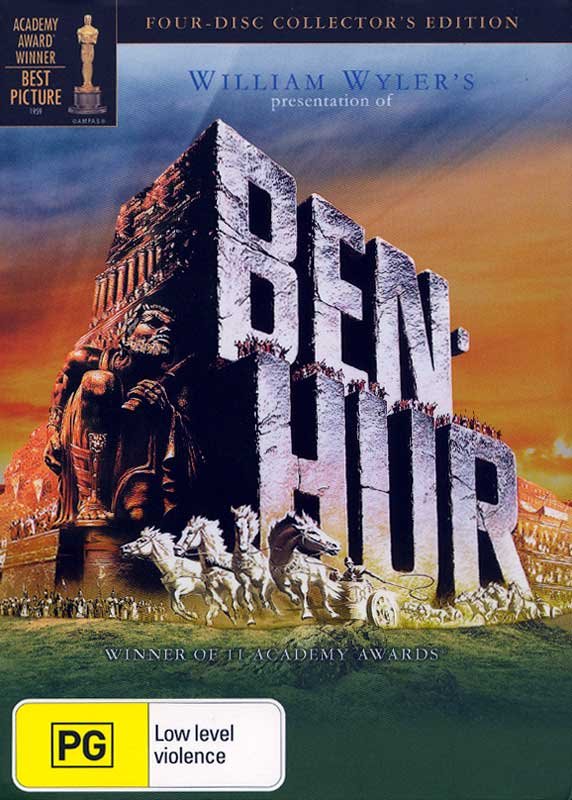
Look at Ben Hur for another example. What do you notice first? The wonderful, iconic image or that yellow blob that competes in its unsubtly with Charlton Heston’s acting?


I wonder if any directors will aim for a particular rating so that the classification sticker won’t compromise the film’s imagery? If I was a director I hope I wouldn’t, but you never know. “I know I’m making Texas Chainsaw Massacre 2, but that yellow sticker would match the poster’s palette best, so do you mind if I don’t show any chainsaws? Or killing? Or actual violence?” Where the colours are concerned, I think the Dr Who packaging below is close to the best you can hope for. Different shade of yellow but, hey, I’ll take what I can get.


Last year a poster for the classic 1920 film Metropolis was sold for $A941,000. It’s a sale that I think shows how significant an artform film art can be. Lucky the poster pre-dates the OFLC. I’m not sure how the price would’ve been affected if there’d been a big green, G-rated blob on it.


Sure, not all film imagery and packaging is as significant or as deserving of respect, but on the whole I think it’s something that deserves to be treated with more respect than the OFLC is affording it now. I like the American system (circled below in green). Discreet, there if you need it, and allowing the cover art to speak with its own voice, unmolested by innumerable bits of superfluous junk. (I know this is a Platinum Edition, and so therefore cleaner than most, but this is my ideal).


I guess I can’t turn back the Australian clock, but at least I can buy Region 1 DVDs if I need to. Thank you Office of Film and Literature Classification for helping to inform my choices.

Tuesday, January 31, 2006

The Lion, etc.

Did you hear me being interviewed on the radio the other week about my thoughts on The Lion, The Witch & The Wardrobe? Ok sure, I was actually just one of a number of callers to ABC talkback, and yes, it was a discussion with Tracy Bartram, but my voice still travelled out across the length and breadth of this wide, brown land we call home... well, across Victoria anyway.

Tracy didn’t like the film, but that’s ok because I don’t like Tracy. I find her irritating, like lemon juice flicked into your eyes.

Tracy was hosting the 774 Breakfast Program while Red Symons was on holiday, and I’ll tell you, there are few things that can snap you into consciousness faster than the coarse sound of Tracy’s voice in the morning. Like a sharp jab to the larynx, it slices through the fog of slumber and wrenches you awake, triggering an apoplectic fit as you flounder frantically for the Snooze button.

Anyway, just as I was about to hurl the alarm clock at the wall, Tracy asked for listeners to phone in with their opinions of the Narnia movie, and started to give her own. My curiosity was captured, and my hand was stayed. For the moment at least. As I said before, she didn’t like it, which put her at odd with her callers, who all did. I wasn’t going to call in, but then I heard her say that one thing that irritated her was that you’ve got these English children in a very English movie and then they go through the wardrobe and the first creature they meet is an American beaver! To me, the beavers’ British accents placed their origin elsewhere, so I thought I’d call to set her straight.

The show’s producer answered the phone and asked for my name and suburb, which I gave her. “Did you like the film,” she asked? “Yes, I did,” I replied. “Ah, good. So did I. She’s on her own here.” He, he.

When I got through to Tracy I told her I liked the film but that I was calling because she’d said that the beavers were American when they were clearly English. The only American accent came from Morgrim the wolf. “Oh no,” she clarified, “I meant the beaver is an American animal.” One wonders why Tracy was troubled at seeing an American beaver in an English setting, but not an African lion, and a… well, you know, a faun, a unicorn, a centaur, and a minotaur? She asked me what I thought of the evil wolf being given an American accent, and I said I found it quite refreshing. Villains, more often than not, have British accents, while the heroes have American ones, as in Star Wars, for example, so I thought it was nice to see it the other way around. She said she guessed that was what was good about the ABC, that everyone was entitled to express their own opinion. I asked if she was going to read the book, and she said she had no intention of doing so. Which is a shame.

So yes, I was very happy with The Lion, The Witch and The Wardrobe. Not a perfect film, but a very satisfying adaptation of the book. I thought Lucy and Edmund were brilliant. Great casting. Peter and Susan were mostly irritating, though fortunately not to the extent of Lucy from the 80’s TV series, who made me want to bash her head in with a paving stone. I also liked how the animals were just animals, and didn’t wear clothes like they did in the TV series. Strangely enough, they looked more dignified without pants on!

I thought the character development in the film was a little heavy-handed and awkward at times, particularly when it came to showing how selfish and irresponsible Edmund was. Yes, I get it! Move on! I don’t know if I would have had Liam Neeson’s voice for Aslan. His voice had the warmth and strength I was expecting, but not the majesty. Maybe James Earl Jones would’ve made the whole thing seem like The Lion King 2, but that’s who I’ve long heard as Aslan. He’s just incredible. (Except when he’s Darth Vader screaming “Noooooooo!” like some overacting, B-grade hack. Then he’s just awful; but, to be fair, I don’t think anyone could have made that line work.)

Contrary to some early reports, the film wasn’t cunning Christian proselytising designed to poison children’s minds with Christian values and soften them up like some sort of pre-evangelism. The underlying allegory was there if you wanted to see it, and easy to miss if you didn’t. In fact, if you didn’t know anything about Christianity, the Christian references would go right over your head. I think a lot of people have been getting too worked up over the issue. The story may be influenced by that of Christianity, but, as Age writer Philippa Hawker recently pointed out, it’s also influenced by “E. Nesbit, Enid Blyton, The Wind in the Willows, Greek mythology, Norse tales, Hans Christian Andersen and schoolboy chivalric fantasies”. Whatever its influences are, I think it’s a wonderful story with a positive message that anyone can enjoy and benefit from hearing.

So one down, somewhere between four and six more to go, depending on who you talk to (apparently not all the books would do well as films). I just hope they make The Last Battle (and make it well), which is my favourite of the Narnia books. Actually, I wonder if people will still call this one ‘Narnia’ when the other films are out? I know ‘The Lion, The Witch and The Wardrobe’ is a bit of a mouthful, but that, not ‘Narnia’, is the film’s title. Yes, yes, The Chronicles of Narnia: The Lion, The Witch and the Wardrobe is the actual title, but if you have to shorten anything it should be the book title, not the series title. What’s wrong with “The Lion, etc.” for example? I think that’s what I’ll use. Maybe people will call them Narnia 1, Narnia 2, and so on? I guess we’ll find out soon enough.